BME™ · Body Modification EzineDesign System · v0.4 · 2026-07-01
Style Guide
A flat brutalist record of the body as it is actually lived in. The rigid frame is the container; the living content is the point. This document is the frame, specified.
00 · Thesis
The tension between rigid frame and living content is the design.
Brutalism is the container: rigid grid, hairline rules, hard edges, zero radius. The content is alive — the organic heritage glyph, real human imagery, member voices. Keep BME's ethos: anti-corporate, community-first, an anthropological record, safety-respecting.
Two registers of one system. BME.COM / News / Wiki is the publisher: serif-led, archival gravity. IAM is the platform: mono-heavy, raw, user-generated. Every surface is BRUTAL or QUIET — never blended.
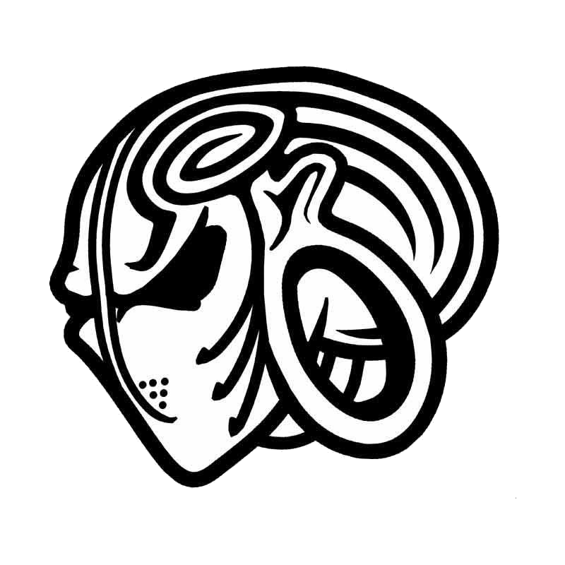
01 · Brand & glyph
The mark is sacred
Mono glyph · on surface
On blue · paper containment (2006 homage)
BME™
Publisher wordmark · Playfair Display
IAM
Platform wordmark · Alfa Slab One
Do
Carry the glyph forward faithfully — it is already flat and tattoo-ready.
Knockout to white on blue only if AA holds, else use a paper containment block.
Keep it mono: black on light, white knockout on dark.
Mark the wordmark as BME™.
Don't
Never stretch, skew, or rotate it. Members tattoo this mark.
Never recolor beyond mono / knockout.
Never outline, add effects, drop-shadow, or decorate it.
Never place it on a busy field with insufficient contrast.
02 · Color tokens
Seven tokens. Clean inversion.
Light and dark are the same tokens, inverted. Blue holds in both. Red is reserved — permitted only for the semantic --danger message token (see §09), never for decoration, structure, or emphasis. All other reds come from real imagery. Click any hex to copy.
--heritage-blue
Dominant brand
Brand wash, headers, brutal-zone fields, gates. In quiet zones it recedes to one marker.
Light · brandDark · brand
White text: 5.3:1 — AA ✓. Holds in both themes.
--deep-heritage-blue
Safety / depth
Safety-bar background, hover / active states, inversion depth.
White text: 7.8:1 — AAA ✓.
--ink
Structure / text
Text & structure (light), superbar background, background base (dark).
On gauze: 19:1 — AAA ✓.
--faded-ink
Dark surface
Dark-mode accent / card surface, one step lifted from ink.
Gauze text on it: 15.8:1 — AAA ✓.
--graphite
Metadata
Metadata, captions, secondary text — both modes.
On gauze: 5.2:1 — AA ✓ body. Avoid <18px light weight.
Light-mode background; primary foreground (text) in dark mode.
Ink on gauze: 19:1 — AAA ✓.
Theme-independent
Two surfaces never invert with light/dark: the superbar (--ink) and the safety bar (--deep-heritage-blue). They are constant chrome across every property.
Superbar — always ink
Safety bar — always deep blue
Secondary · message paletteSignal hues tuned for clarity · danger is the sole sanctioned red · all other reds come from imagery
Completed actions, confirmations, recorded submissions.
Warning
--warning
#DFA837
Gated or restricted state; something needs attention.
Caution
--caution
#D87B32
Irreversible or visibility-changing action ahead. Confirm first.
Danger / errorRed · exception
--danger
#C14856
The sole sanctioned red. Errors and destructive outcomes only.
Note
--note
oklch(0.54 0.125 312)
Announcements, new features, low-urgency editorial notes.
03 · Typography
Two registers, one system
Playfair Display
Publisher masthead & headlines
Didone-class, refined-editorial
BME
Alfa Slab One
IAM & internal-page headlines
Blunt industrial slab
IAM
Source Serif 4
Reading body
Line-height 1.55–1.65, measure 60–72ch
The body is a place people live in.
IBM Plex Mono
Labels, bylines, timestamps, all IAM body
System voice, mono
2026-07-01 14:02 UTC
Scale specimen · headlines uppercase or sentence case, never title case
60 / .9Display
38 / 1.08Publisher headline
18.5 / 1.62Reading body — measure 60–72ch, line-height 1.55–1.65
11 / .12emMono label · byline · 2026-07-01 14:02 UTC · tag
Inline treatments · in context
The archive records the body plainly: bold for a claim that matters, italic for a term of art, and both when a name is first set down. Corrections are shown, never hidden — the old figure the corrected one. A phrase can be held up for emphasis without shouting. Reference a token inline as --heritage-blue, cite a measure of 601–72ch, and set an era in small caps, since 1994.
Links · underlined always, never color alone · state changes instant & hard
Links are heritage-blue and always underlined. Read the tier policy or browse the gallery index — these two are live: hover and press them.
The four states below are shown statically for reference.
Default
view experience
--heritage-blue · #6163BA
Hover
view experience
--deep-heritage-blue + wash
Active
view experience
gauze on --deep-heritage-blue
Visited
view experience
muted indigo · #71738F
Block elements · quotes, code, lists, rules
Drop cap · article open
The first time most people saw a body leave the ground on hooks, it was through a screen — a clip, a thread, a photograph on a server that no longer exists.
Blockquote · with citation
View with respect and intelligence, or don't view at all.— Standing policy, since 1994
Code block · IBM Plex Mono, hairline-framed, no radius
:root{
  --heritage-blue:#6163BA;   /* dominant brand */
  --danger:#C14856;          /* the one sanctioned red */
}
.gate{ border:1px solid var(--line); border-radius:0; }
Unordered · square markers
OPEN — visible to everyone
COMMUNITY — signed-in members
GATED — age-gated, click to reveal
Ordered · decimal
Submit the experience
Set its tier
The desk reviews and records it
Rules & caption
1px hairline
3px section rule
Figure 1 — Beam suspension, two-point. Submitter retains all rights. Documented, not instructional.
04 · Spacing & grid
Show the structure
Spacing scale (px)
4
8
12
16
20
28
40
60
Layout rules
Body max-width 1280px, centered.
Consistent L/R margin: 28px (24–32 responsive).
Masthead base rule: 3px. All other rules: 1px hairline.
Hairline dividers at 100% or 18–20% opacity — never invisible.
Zero border-radius. Zero drop-shadow. Zero gradient.
Prefer flex/grid with gap over margins between siblings.
05 · Chrome stack
Every page, top to bottom
Full-width bars are theme-independent and persist across all properties. Header and navbar are margined and property-dependent.
Tiers run OPEN → COMMUNITY → GATED. Sensitive media defaults to monochrome + blur + a typographic warning cover; the reveal is one deliberate act. No how-to, ever.
Live demo · click-to-reveal
GATED · COVERED
Fresh scarification
Graphic documentation. A record, not instruction. View with respect and intelligence, or don't view at all.
Revealed
[ ARCHIVAL PLATE · REAL MEDIA DROPS IN ]
09 · Flash & system messages
Messages don't apologize
Mono, hairline-ruled, hard-edged. Six semantic levels, each keyed to a secondary token. The accent bar and dot carry the color; the label and body stay neutral so they clear AA on any surface in both themes. Danger is the one place red is allowed — nowhere else. No "Oops!", no "Submit". Empty states are invitations.
Notice
Your submission is queued for review. 4,883 images are ahead of it. The archive grows because people submit.
Success
Diary entry recorded. It is visible to the community at the COMMUNITY tier and time-stamped 2026-07-01 14:02 UTC.
Warning
This gallery holds COMMUNITY-tier work. Sign in as a member to view it in full.
Caution
You are about to set this entry to OPEN — visible to everyone, signed in or not. Confirm the tier before you record it.
Could not save
The diary entry needs a date and a body before it can be recorded. Add both and record it again.
Note
Galleries can now be arranged by heal date. Your existing order is unchanged.
Nothing here yet.
The archive grows because people submit. Add yours.
10 · Voice & microcopy
Insider documentarian
Say
"View with respect and intelligence, or don't view at all."
"The archive grows because people submit. Add yours."
"BME documents risk; it does not endorse or instruct."
Serious, respectful, from within the community.
Never
SaaS microcopy — "Oops!", "Submit", "Awesome!"
Profanity in UI; crude, touristic, or academic-outsider tone.
Vague or apologetic errors.
Dopamine mechanics, streaks, engagement bait.
11 · Accessibility floor
Non-negotiable
Contrast
WCAG AA on all body and warning text in both modes. White-on-blue clears AA or uses a paper containment block.
Keyboard
Visible focus on every interactive element — a hard blue outline, offset 2px. Full keyboard operability.
Motion
prefers-reduced-motion respected. No ambient animation, carousels, or infinite scroll. State changes are instant and hard.
Gates & warnings
Screen-reader legible, never image-only. Warnings carry real text; reveal is an explicit, labeled action.
Focus state · hard blue outline (tab to it)
12 · Examples
Prototype screens
The system assembled into real pages. Everything above — tokens, chrome, components, safety — shown in place. Two registers share the chrome: publisher (BME.COM, Playfair masthead, serif reading) and platform (IAM, Alfa Slab masthead, mono body). The age gate is a bespoke full-bleed interstitial. Open any screen in a new tab.
A full-bleed blue interstitial stated plainly — real documentation, entered by deliberate choice.
13 · Foundation
Baseline tokens & Tailwind config
One source of truth every property builds on. Foundational tokens are fixed; semantic roles — bg / surface / fg / line — invert under .dark. The superbar and safety bar never invert. Copy a block straight into your repo.
tokens.css
Foundational + semantic custom properties. Semantic roles invert under .dark.
 Mono glyph · on surface